
myGlossier
One of Glossier’s mottos is ‘You Look Good’, but whether you feel good, seems to have been put to the back of the mind when designing Glossier’s instore infrastructure.
This is a case study about how I designed a mobile phone application which makes you feel good when you shop by removing friction points. This was a personal project completed whilst I worked at the Glossier store in Covent Garden.
It was completely unexpected that I would take this on, but it was basically a no-brainer for me to do. There was only so many times I could hear people ask how the store works…
I hope you enjoy reading through the inner workings of my mind whilst I apply a UX process to reach a result I’m pretty chuffed with.
My Role
Sole designer and researcher
Type
Self initiated concept
Status
Prototype tested with staff and customers. Not live.
Timeframe
Three months, alongside working in the store
The Problem
The store purchasing process wasn’t designed correctly for the most common customers that were visiting the store. New customers didn’t know how the store worked, and returning customers were frustrated with how long it took to buy something.
Goals
Make it easy for everyone to buy something
Remove accessibility barriers in store
Improve customer retention and brand relationship
Increase average order value

01
the problem
I witnessed it every day for a month
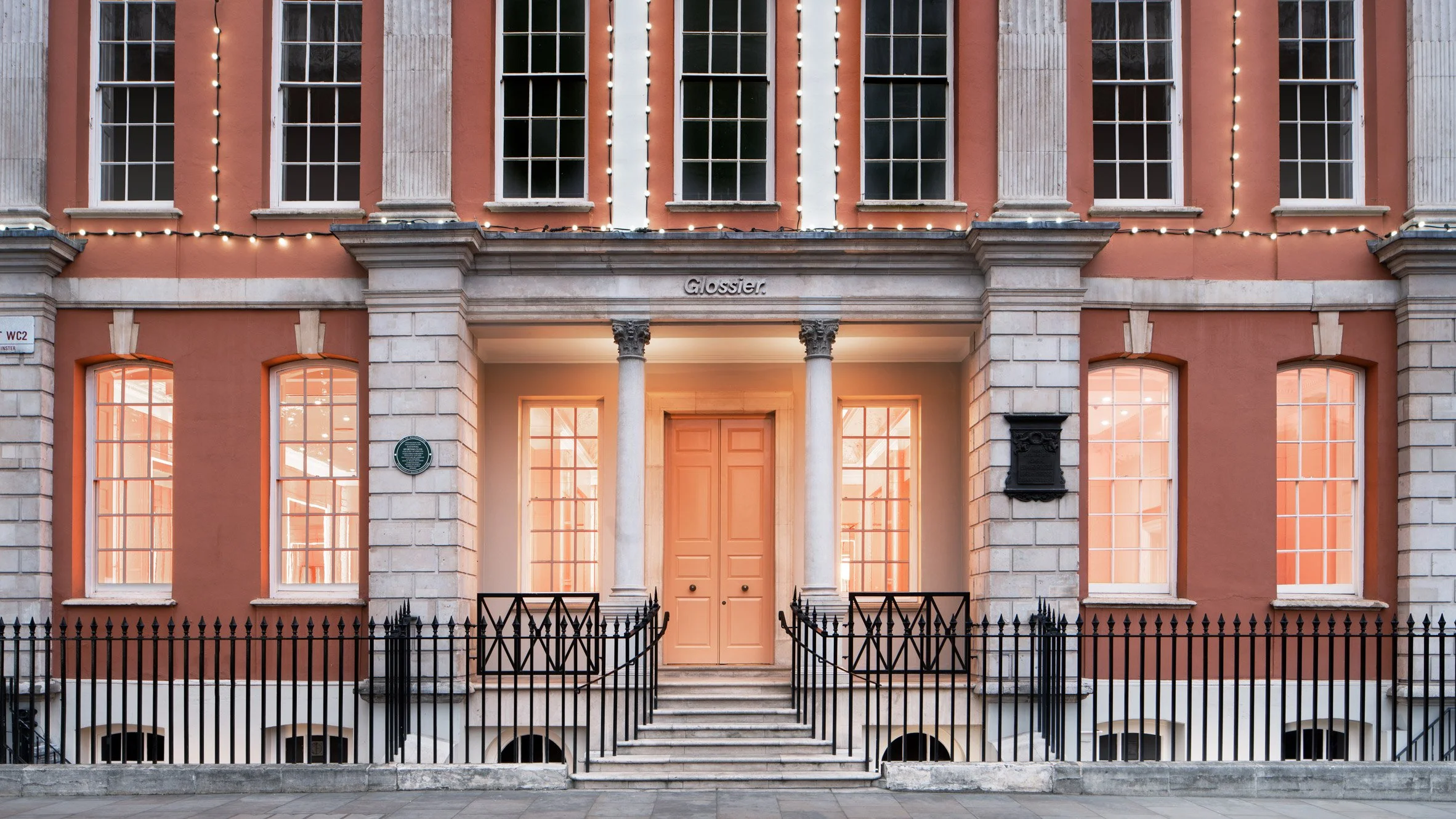
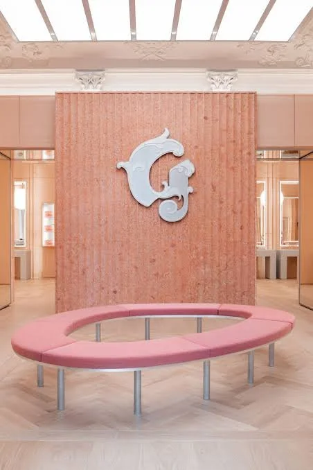
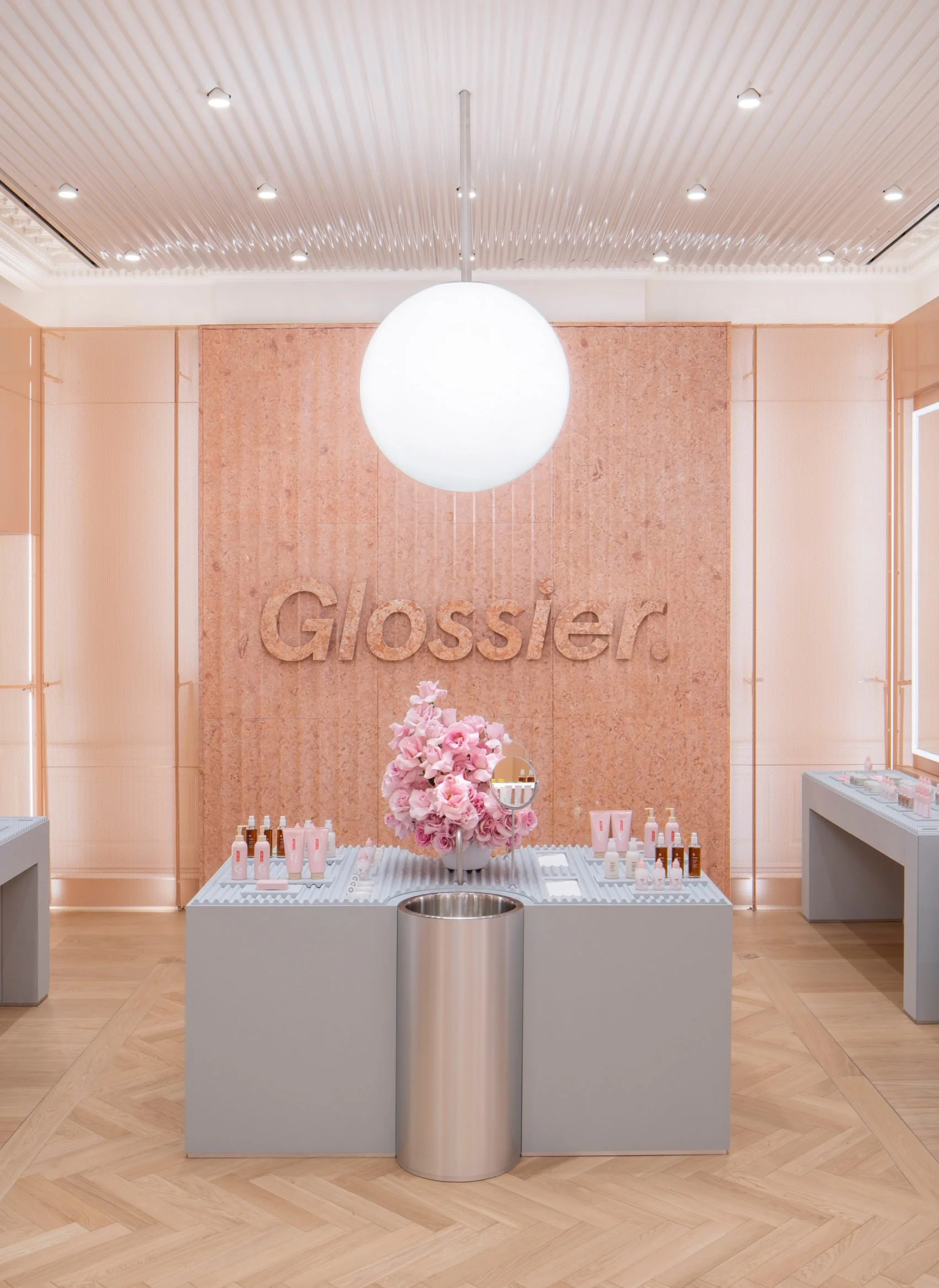
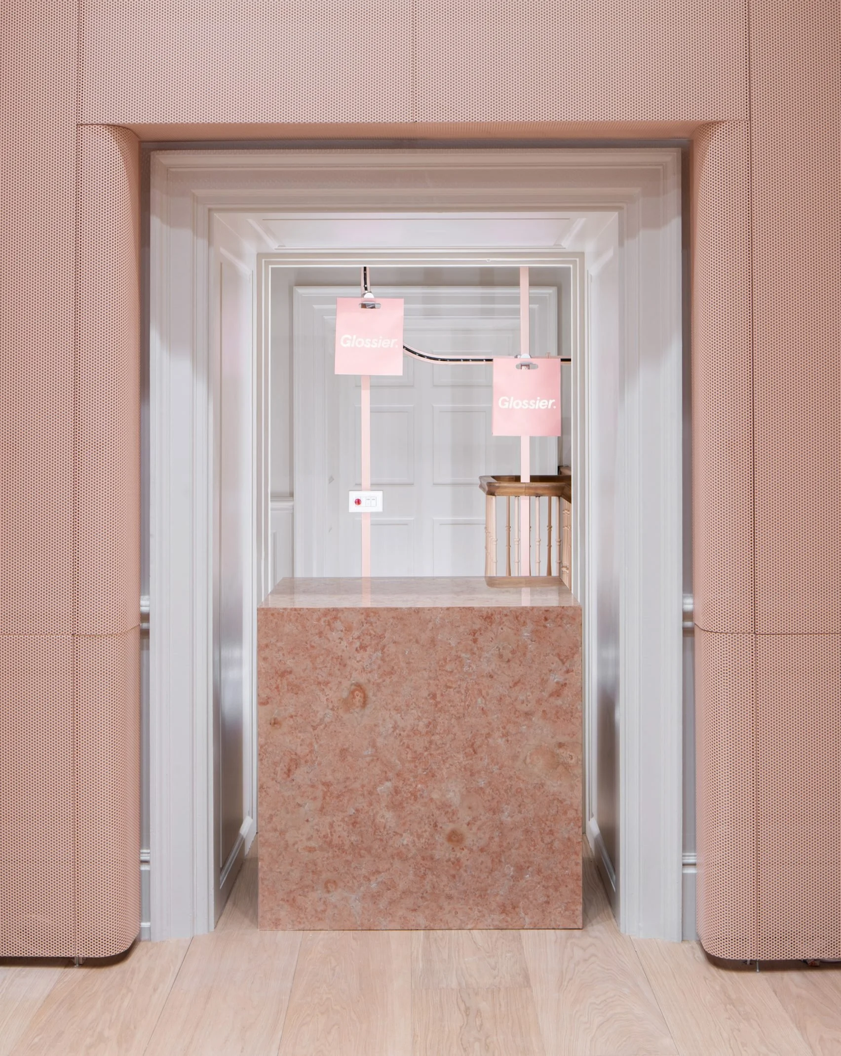
There is no denying that the aesthetic of Glossier’s stores is second to none. It is beautiful, and that is what draws customers in: the big pink door, the girly interior, the ample opportunities for Instagram photos. Once you get past that, the actual experience of buying something is chaotic.
I have lost count of the number of times I was asked how to buy something, or what to do once they had bought it. So the problem, on the surface, was this.
NEW CUSTOMERS
Didn’t have a clue how to pay
The only way to find out was an Editor reciting the same paragraph 100+ times a day. Miss it, or not speak English, and you were lost.
“Product tables are full of testers only. If you want to purchase any of these, find a girl in a pink jumpsuit carrying an iPad. You then order and pay with her using contactless payment. Your order then takes five minutes to appear at the collection point.”
— the script every Editor recited
RETURNING CUSTOMERS
Didn't want the faff
People on their lunch break wanting to pick something up fast. Instead they’re greeted with a queue on the street, a wait to pay, then a rotating carousel moving at 0.1mph. That’s a lot of waiting to pick up 1 Lash Slick.


“I’ve been queuing 10 minutes to get in, then waiting to pay, and now waiting in the collection room. It’s exhausting.”
— Roisin, 29, London
02
the research
It was a problem for me…
But was it a problem for everyone else?
I was annoyed on these customers’ behalf, and fairly sure they were annoyed too. But, my mind-reading may have been deceiving me, so I needed to do this properly, starting with secondary research.
Secondary research
Questions I wanted answers to included:
What are Glossier’s current goals, values and ambitions?
What had Glossier done to help the store experience already?
Can AI be used to enhance the store experience?
Who are Glossier’s top competitors?
What has been psychologically proven to enhance the store experience?
These types of questions would help me understand what sort of solution would suit Glossier’s business goals, whilst meeting their customers needs.
The findings
AI powered technologies are frequently shown to enhance the instore experience.
Specifically, retail brand commitment, aesthetic reaction, revisit retention, purchase intention and engagement.
This was found to be most prominent amongst young customers, take a look at these articles.
Linner & Olsson, 2022; Abed & Lopez, 2021; Lee, Lee & Kim (2020)
A great store experience keeps the customer engaged, and AI is a great way to go about doing that.
Specifically, research states technology at different touchpoints is a great way to go about it.
In 2023, 85% of consumers were accepting of AI in store and this rises each year.
Who are Glossier’s competitors and what are they doing?
Knowing who Glossier is competing against is really useful for knowing what has worked for them, and what hasn’t.
I visited each of the stores in person, but also did some internet delving to answer my questions.
I just had two simple ones,which were:
Are competitors using any technology in-store?
Do customers enjoy their current store experience?
Glossier’s main competitors as of 2024 were (L-R: Charlotte Tilbury, Space NK, The Ordinary, and M.A.C Cosmetics).
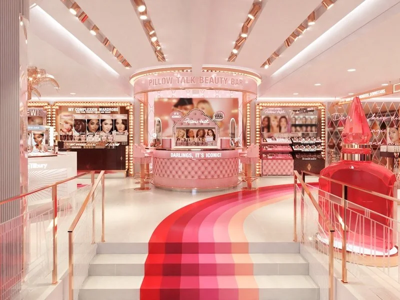
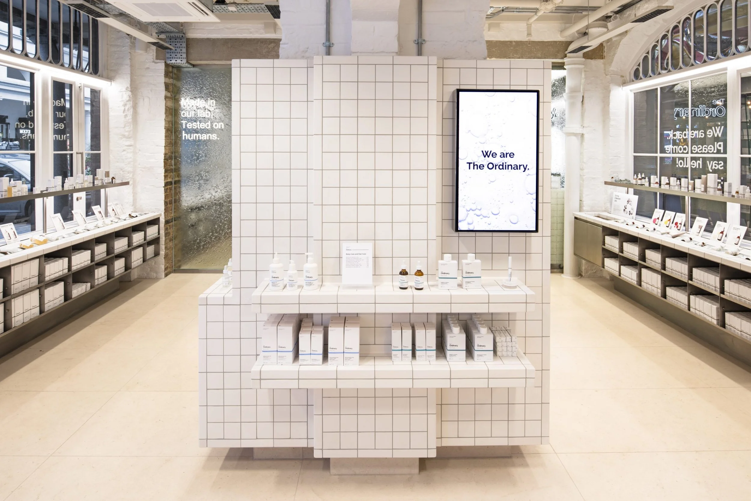
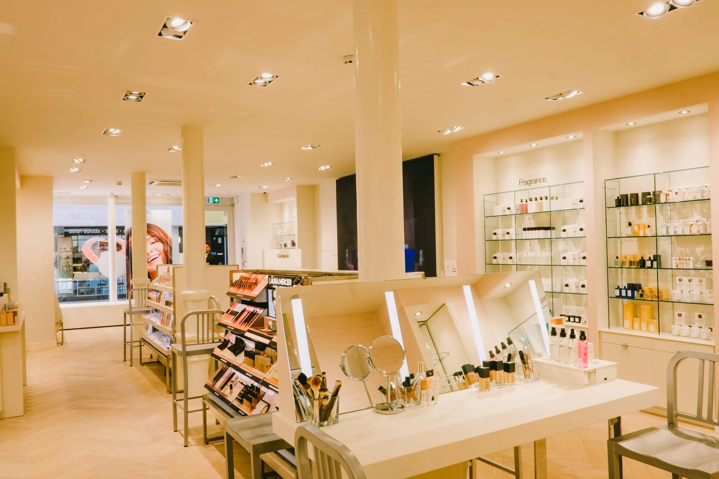
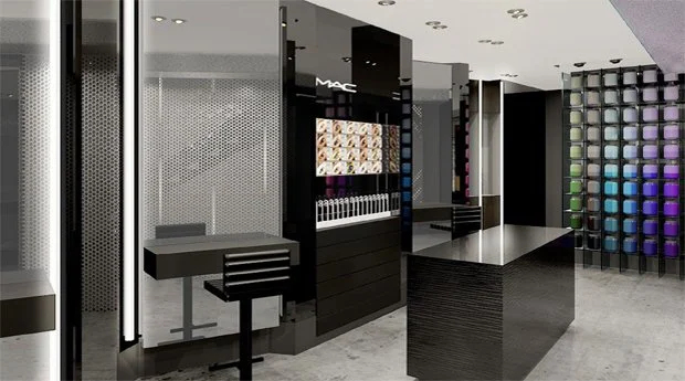
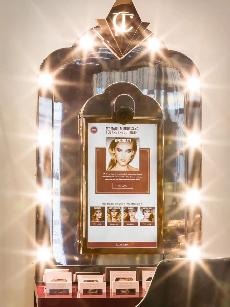
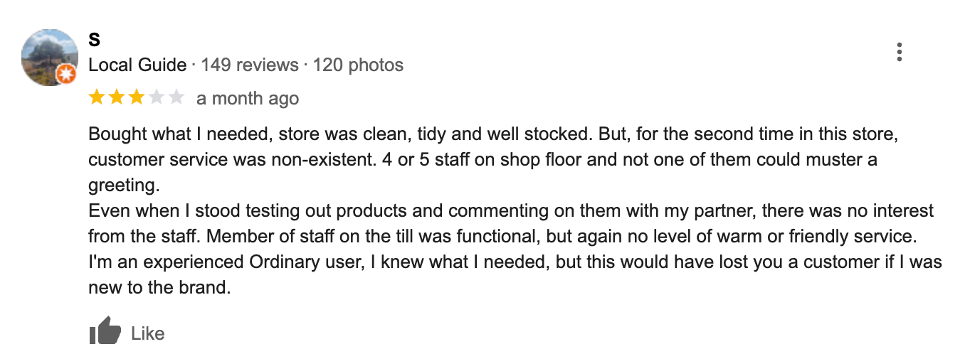
None of them currently use any sort of technology in-store to enhance the experience.
Charlotte Tilbury did at one point have an interactive mirror but that got scrapped pretty quickly, but I couldn’t find out why. It launched in May 2028, find out more about the interactive mirror here.
Across all four stores they had the same issues with customer service
Rude staff, overcrowding, poor service. Nobody in this category has solved the store experience.
Putting my biases to one side before speaking to customers
Now I had gathered some crucial info from competitors, I needed to speak to Glossier’s customers.
However, I was very conscious of the fact I had built up biases which I wanted to get down on paper. This massively helped in making me aware of when I could be biasing the data with my own views. I really had to check myself with the types of questions I asked and not trying to get the answers I wanted.
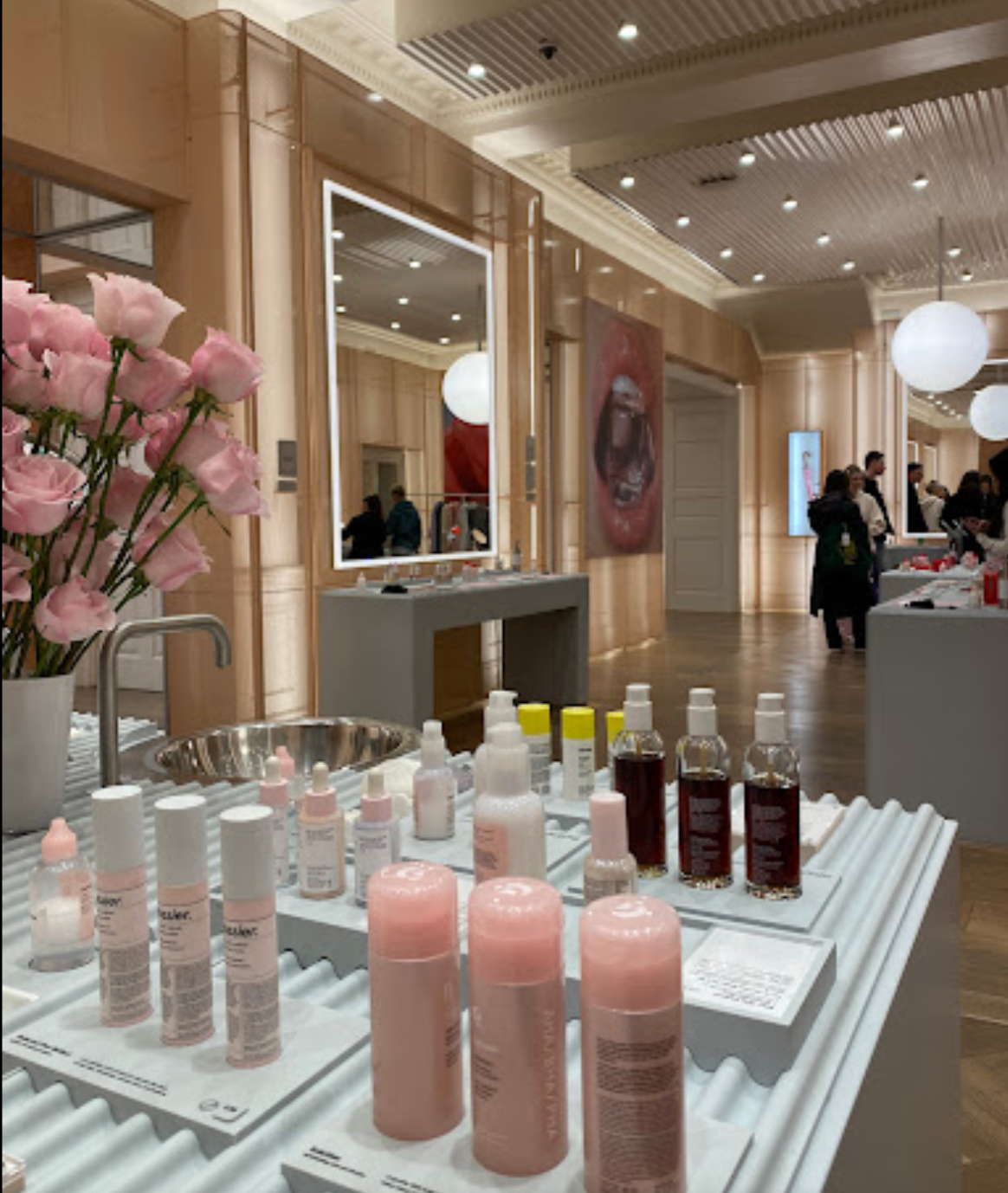
Actions speak louder than words
However, before the talking stage I wanted to just simply observe what customers did in store. Using a mixed methods framework allowed me to gain the most valid, reliable data I could. Also, it was super easy for me to observe customers, as this was what I had to do anyway so customers wouldn’t be uncomfortable with me standing there.
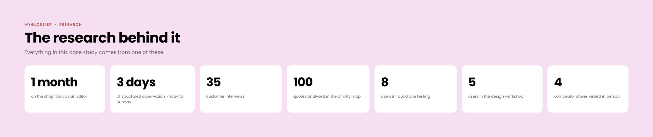
I carried this out over 3 days, from Friday through till Sunday when Glossier had its most diverse range of customers.
I used techniques including facial expression analysis, staff-customer interactions, verbal behaviour and group dynamics. These kept my observation focused and kept assumptions at bay.
What I observed
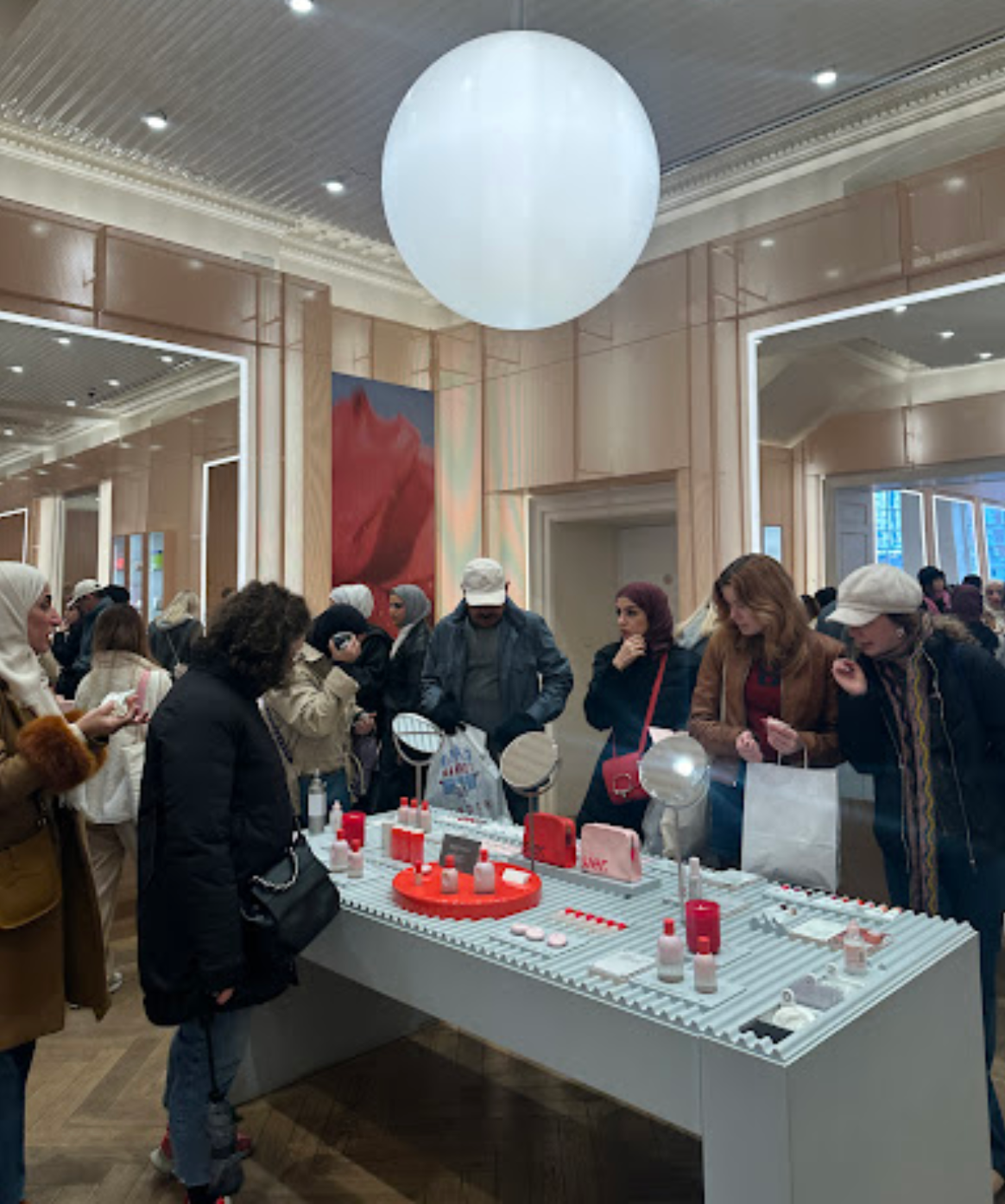
I observed what I expected, which was ultimately customers were confused when they did not receive direction from Editors. This was more common when the store was busier, as Editors were busier and less free to help every customer. Therefore, a busier store equalled generally higher customer friction.
A herd mentality
Customers grouped into the sections of the store which were already busy.
Lots of confused faces
Paying is the hardest challenge
“I’m in a wheelchair as you can see, and it’s pretty busy so it hasn’t been the most enjoyable. It’s hard to get to testers, and just to move around when there’s so many people”
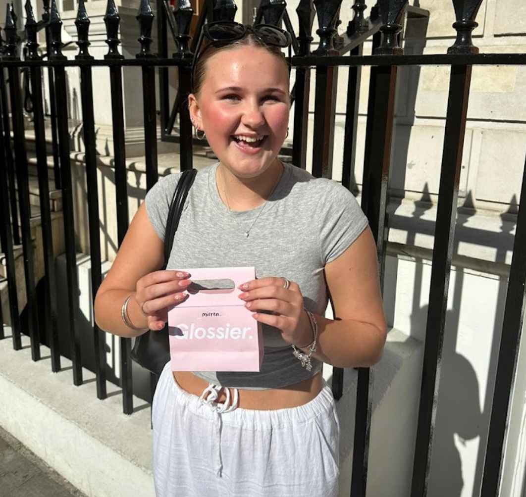
Finally it was time to chat
I ran user interviews the following weekend, Friday to Sunday. My goals were to identify pain points, motivations, expectations and needs across the store experience, and to understand how customers felt about AI being used in store.
My style was conversational and relaxed, to mimic how I talk to customers at work. I interviewed 35 people, which was the point at which I stopped hearing anything new.
One honest limitation: because customers knew I worked there, some of them were softer in their criticism than they might have been with a stranger.
Interview script
What was your motivation to visit Glossier today?
What were your expectations before visiting Glossier today?
Have you enjoyed your experience in Glossier today?
Would you come back to this Glossier store in the future?
Is there anything you would change about your experience in store today?
Would you be interested in using technology in store to enhance your experience?
Although observation may build more valid data, interviews are great to build a connection with your users. I understood what they were frustrated with, which were namely logistical. The only downside to this was many customers don’t speak English, but that is a problem of it’s own!
This script was great for getting open ended answers to access details I wouldn’t have got otherwise.
“I honestly just wanted to come in and buy a mascara, and I’ve been queuing for 10 minutes to get in. Then, I had to wait to pay with you, and now I have to wait for it in the waiting room…It’s exhausting!”
03
Making it make sense
Post it notes are your bestfriend
Now I had done the research, and had a really good amount of data to analyse.
Knowledge, time and mood worked together to decide whether the store experience was an enjoyable one or a terrible one.
Knowledge, time and mood ultimately worked together to equal the store experience, and whether it was an enjoyable one or a terrible one.
Identifying Glossier’s most common customer types
Based upon the 2 most common customers I saw in store, I created two fictional personas based on their traits. I followed these up with user journeys, I based these on the most common problems presented by these users.
I used these during design to make sure I didn’t lose sight of who I was designing for.
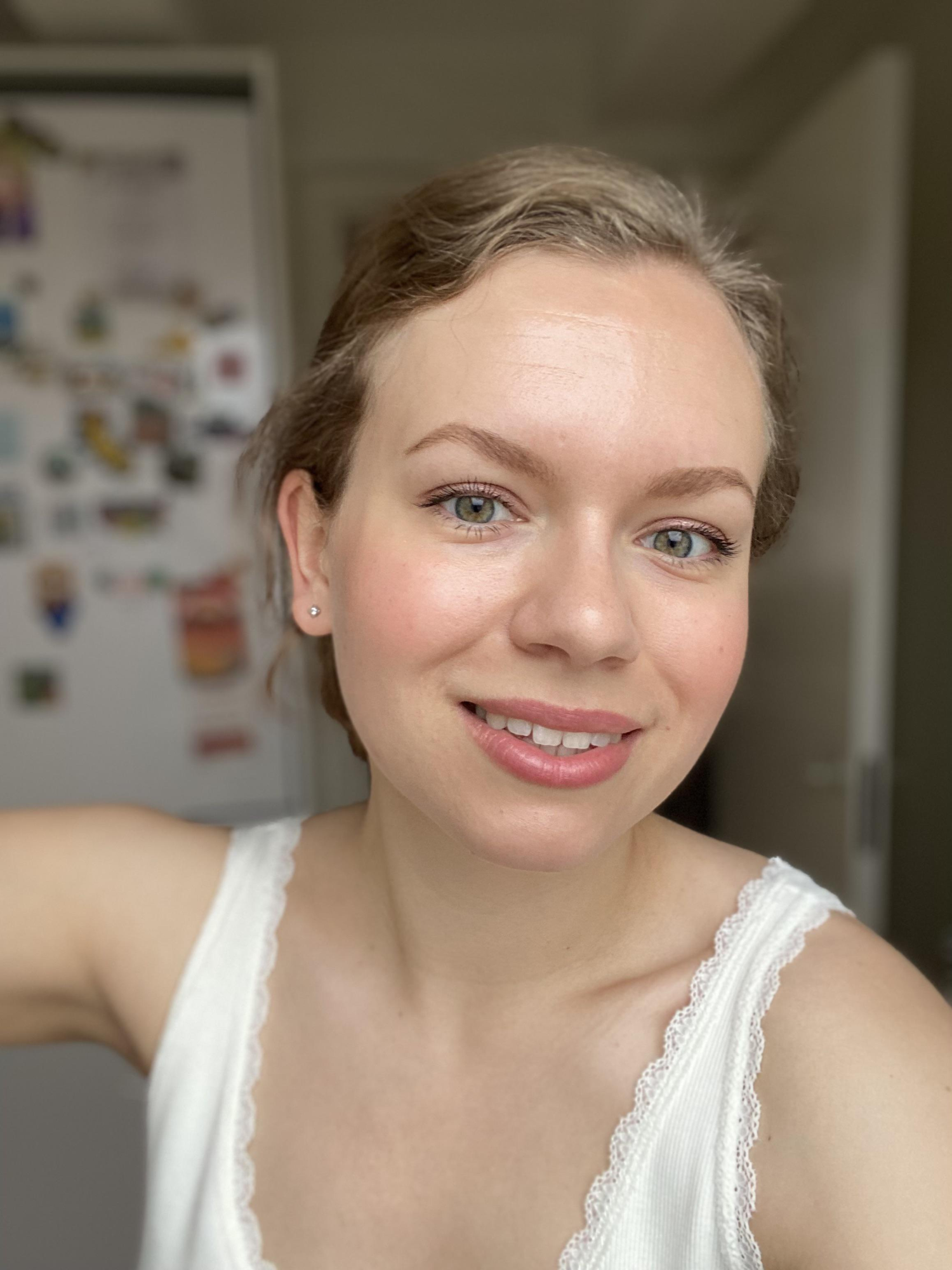
Jemma
29, London, A loyal Glossier customer
Only shopped online, but never in store before.
Needs
Quick service, affordable products, nice staff, rewards

Jeremy
30, Norway, Visiting for his girlfriend
Needs
Help buying gift, now to purchase, Norwegian speaker
Reframing the problem
How might we help the most common customer types have a better in-store experience at Glossier, Covent Garden?
04
Designing it
Designing for people, not the ego
Doing a workshop, before I designed anything
I already had a solution in my head, and I wanted users to arrive at one before I showed them mine. So I ran a design workshop with five users, to discuss and sketch solutions that used AI.
Key questions that guided the workshop were:
What are Glossier’s and their customer’s core values?
How might we ensure the store experience is inclusive?
How might we reduce uncertainty for new customers?
How might we speed up the experience for returning customers?
How might we encourage customers to return to store?
We turned the complaints into the opposite of themselves, and those became the values I designed against.
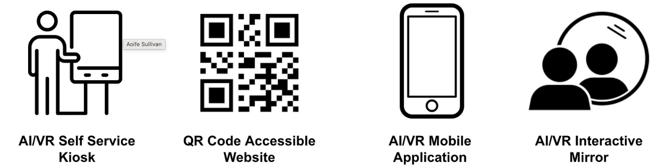
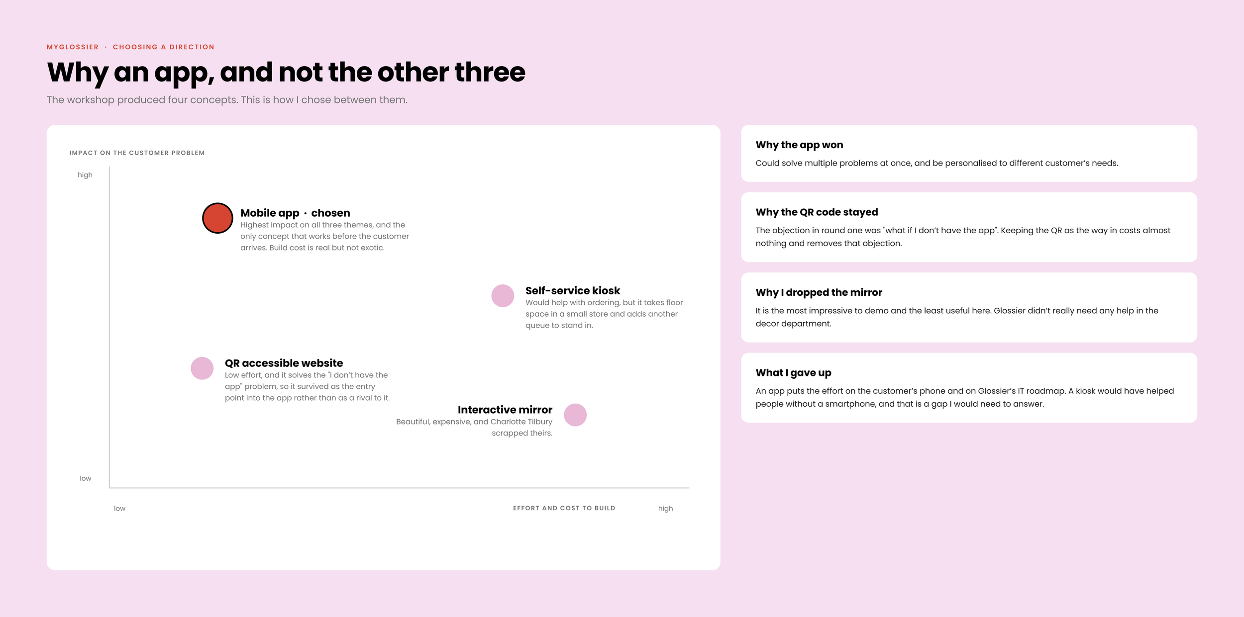
Then the ideas came, including virtual queues, AI editors, VR mirrors, private shopping hours, scan and go. Four survived long enough to be argued about properly.
Main ideas the workshop produced

How the concept was chosen
My favourite name got ditched because my users said it reminded them of Costco
I had named the app glossgo, as I enjoyed the simplicity and half-rhyme, alliteration. I felt it fit well with Glossier’s branding, and signified quite well that the app’s purpose was to help you whilst on the go. However, my user’s couldn’t see past how it sounded very much like Costco, and thought it would have a similar premise to Pokemon Go. I scrapped this name pronto..
Say goodbye to glossgo and hello to myGlossier.
Rationale behind the ‘myGlossier’ name
I chose the name myGlossier because it fit with Glossier’s simple, cool girl brand identity. Aesthetically, it looked great and adding ‘my’ in front was the simplest way to explain what the app encompassed. It’s ‘my’ experience, it showcases very simply that the app aims to personalise your experience.
Acknowleding customer needs
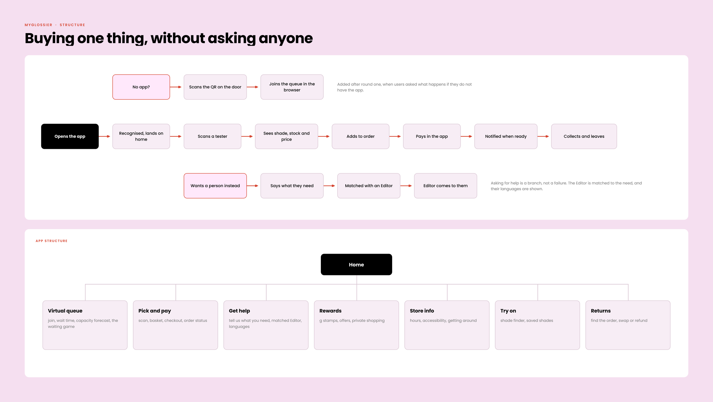
My research revealed that there are different customer types, those who want to get in and out in 5 minutes, those who want to spend an hour there talking with an editor and those who don’t even have the app. The image below shows the the app structure and how I make sure all these customer types needs are met.
ROUND ONE · LO-FIDELITY · EIGHT USERS
Time to frame it
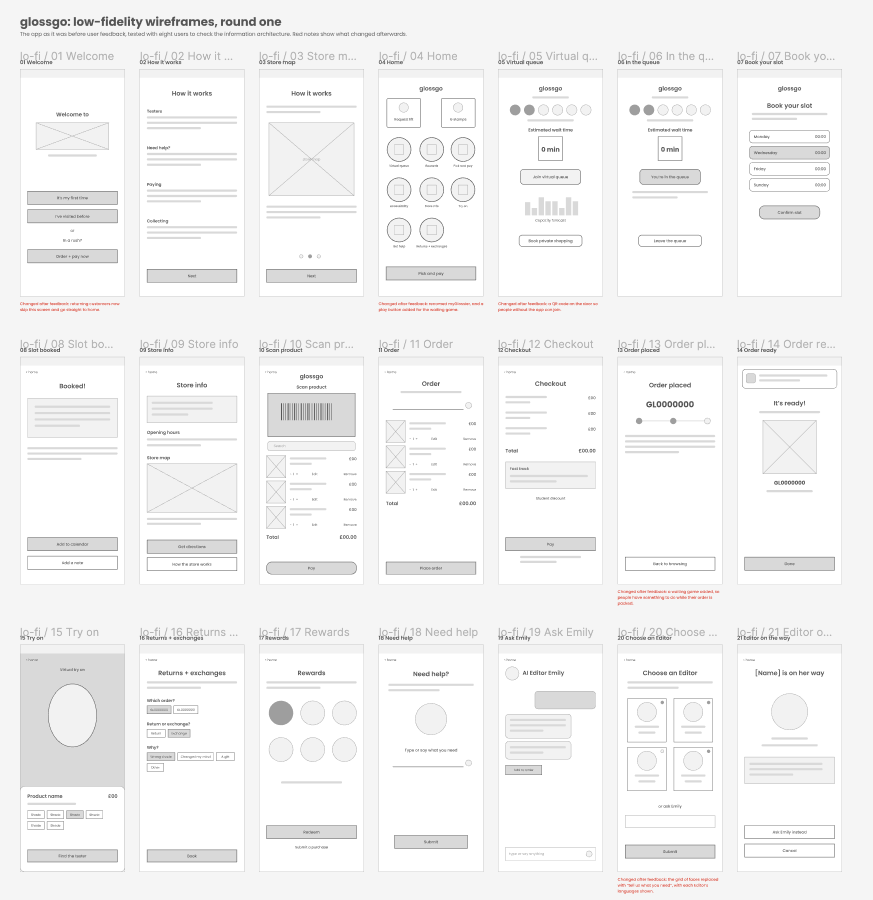
I set about creating lo-fidelity wireframes, I used the data findings from my workshop, and earlier research to inform the features and layout.
This was essential for me to get to grips with the information architecture, and test out what information is best suited where.
ROUND TWO · HIGH-FIDELITY PROTOTYPE
Iterate to make it great
From the early wireframes I had toyed with alternative designs, and had tested these with users to understand their thoughts. I had incorporated more UI elements at this stage as I wanted to observe users behaviour and thoughts whilst interacting with the prototype.
Feedback
Overall, users enjoyed most of the overall simple, minimal UI design and branding as it mirrored Glossier’s existing style. However, they were unsure of some functionality and UI features at this stage.
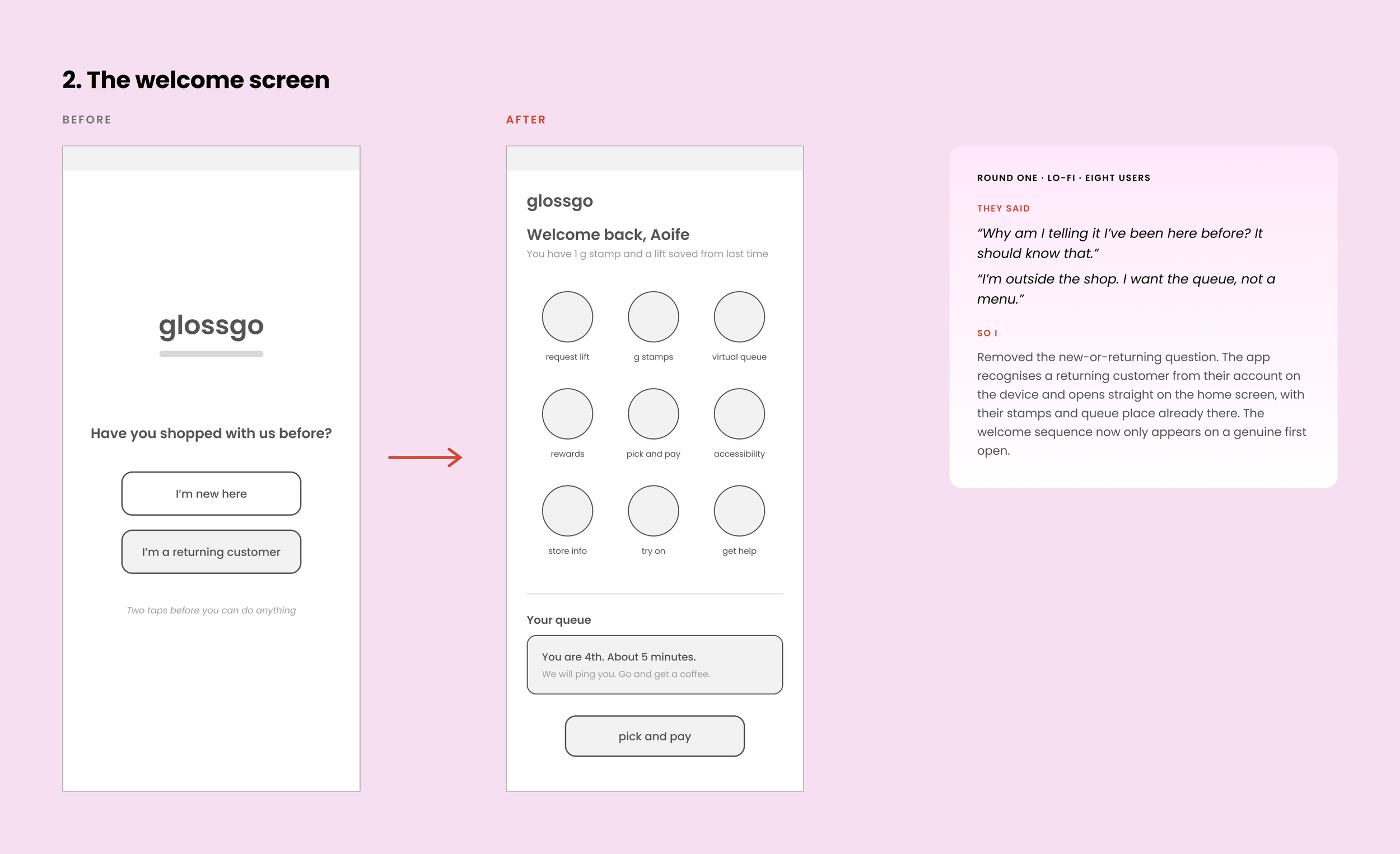
I removed the welcome screen for returning customers using AI
The welcome screen was introduced as a way to acknowledge that not every customer has visited before. However, the feedback was that surely AI could remember if you have visited before. Therefore, this screen added unnecessary effort for the user.
I stopped asking people to choose an Editor
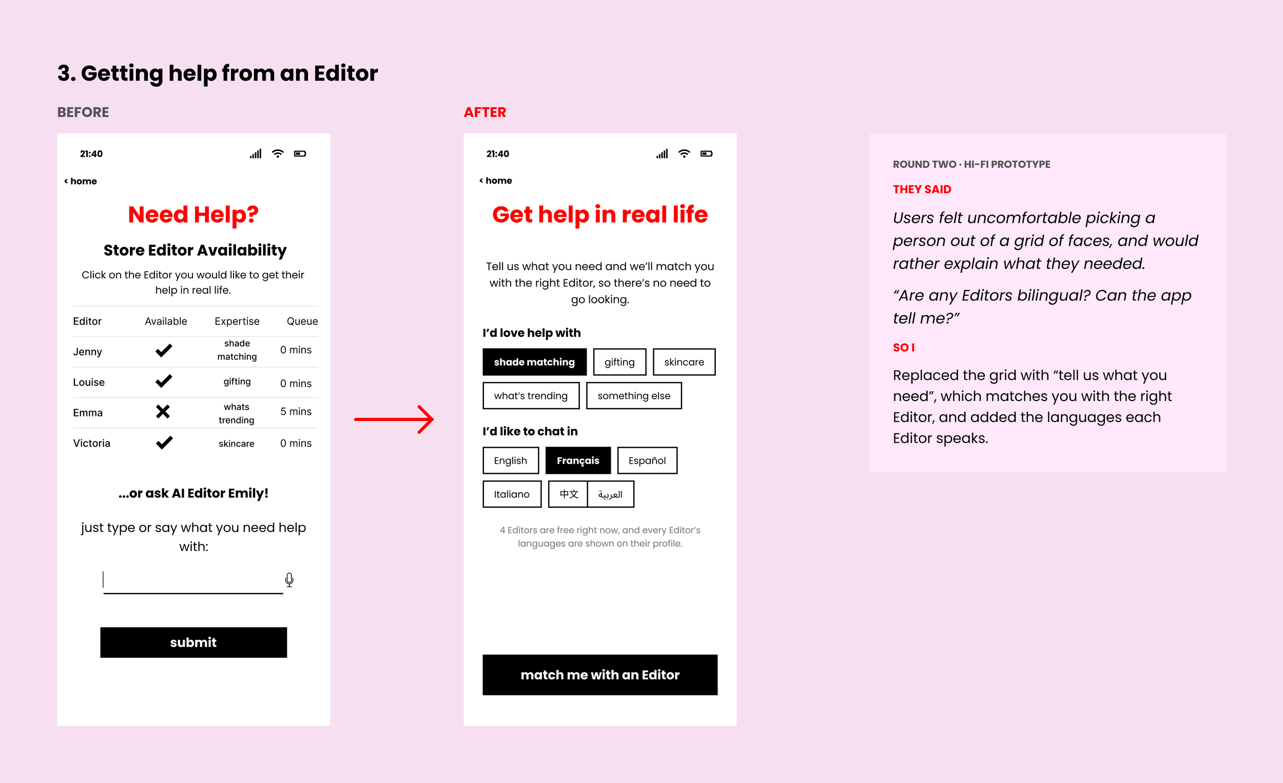
Users felt uncomfortable picking a person out of a grid of faces. They would rather explain what they needed help with and be matched to somebody, so I added that, along with a virtual Editor for the times when every member of staff is busy or they just didn’t want to talk to a human.
User feedback
I presented these wireframes along with others which included; accessibility, returns and exchanges and rewards to the original group of 5 users, plus an additional 3 users.
This is so that I had both people who understood the thinking and people who were seeing it for the first time. The below quotes is just a glimpse into the amount of feedback I got.
THEY SAID
"What if I don't have the app? How do I join the queue?"
SO I
Added a QR entry point at the door.
THEY SAID
"Are any Editors bilingual? Can the app tell me?"
SO I
Put languages on every Editor profile.
THEY SAID
"Give us something to do while we wait, or something back for waiting."
SO I
Built the Editor game and the sticker.
05
Back to the research
I took it back into the store
Once I had made the changes from round two, I took the prototype onto the shop floor, with my manager’s permission.
My colleagues were more excited than I expected. No more reciting the store process, no more angry customers. Customers liked that they could scan a product to buy it, rather than having to find someone to order and pay with.
This was feedback on the idea rather than a measured test, which is why the next round of testing is key!
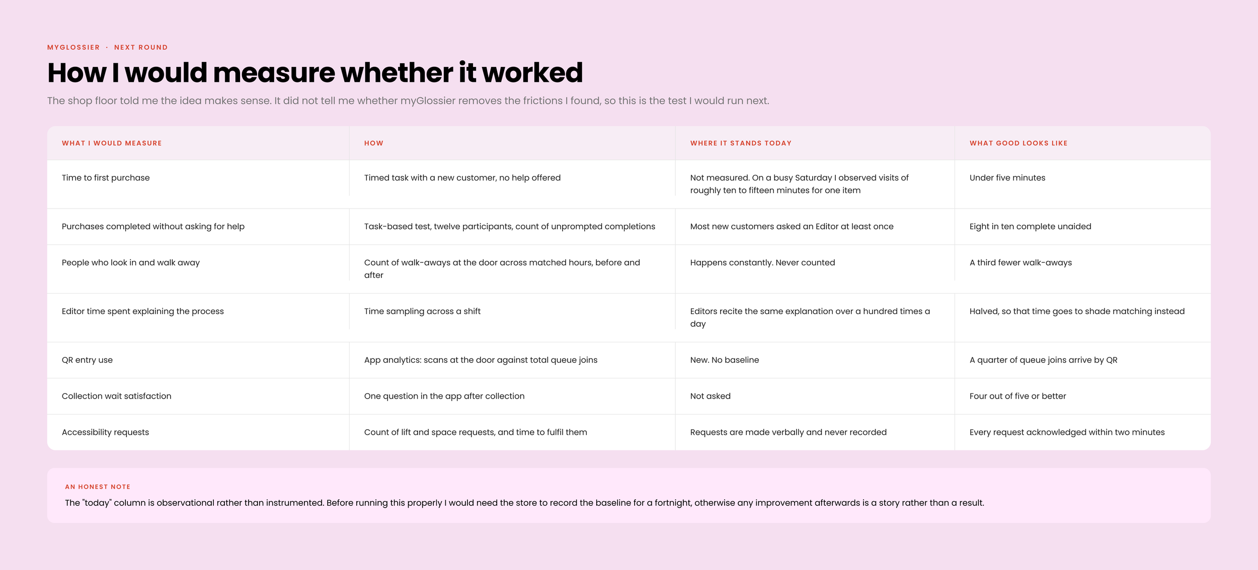
How I would measure whether it worked
This is the test I would run next, with what I would measure, how, where it stands today and what would count as success.
I’m so happy that customers don’t just have to pay through us, and we don’t have to explain how the store works as much, that is so exhausting!
I’d have more energy to help customers too, this app needs to happen asap!
Zoe, 23, London
What I plan on doing next
The people I work with told me the idea makes sense to them. What it has not told me is whether myGlossier actually removes the frictions I found, so the next round would be task-based and timed.
I’d like to do things like:
Time to first purchase
See if a person can buy without asking anyone
Whether anyone uses the QR code to access the app
Unfortunately this hasn’t been possible yet due to a lot of red tape, but I’m working on it.
I’d like to see Glossier trial it next.
I’ve created an app prototype tested with real users, all I need is the permission to test it in store, Emily Weiss?
06
The solution
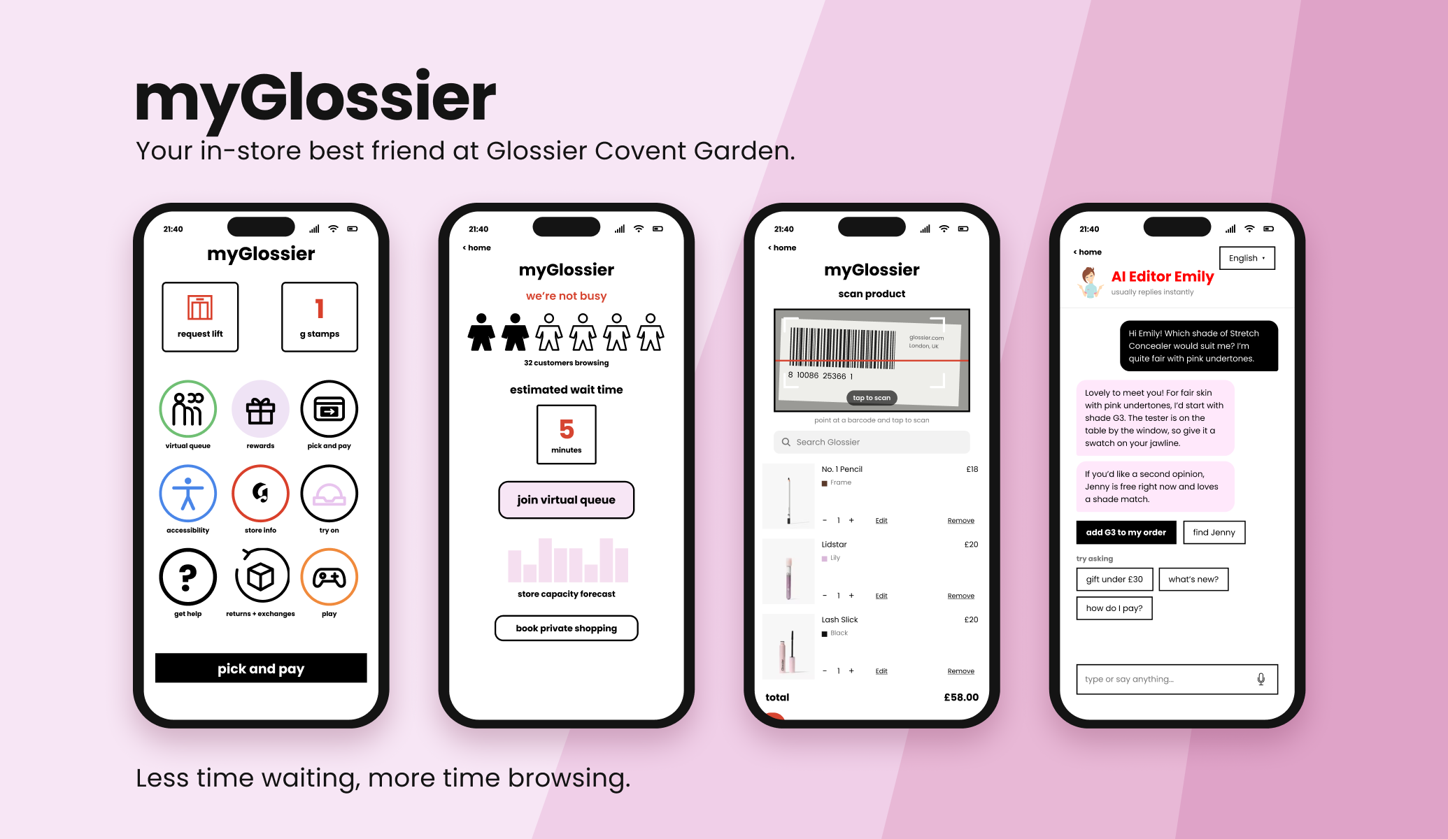
Say hello to myGlossier
Your new instore bestfriend, exclusively designed for Glossier, Covent Garden.
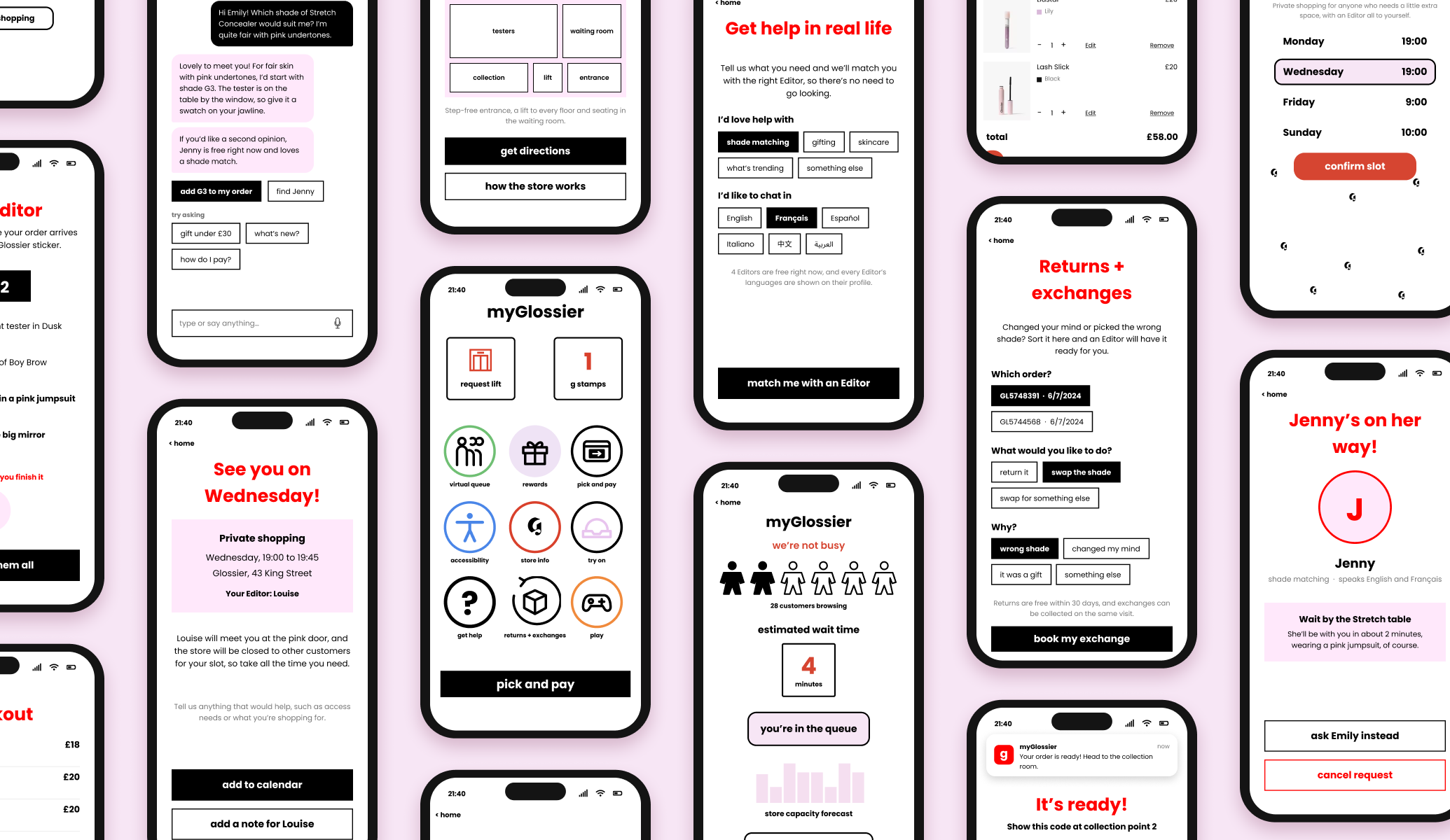
myGlossier blends the digital and physical sides of the shop: join the queue before you arrive, scan and pay for what you like, get matched with the right Editor, and collect when it is ready.
A NOTE ON BRANDING, DESIGN AND COPY
I researched Glossier’s identity through Instagram, YouTube and their site, and I was in the store most days helping customers, so I knew the brand well. I used that to design the app in Figma so it would not look out of place.
ANSWERS · ACCESSIBILITY
Too busy? Need some space? myGlossier’s got you.
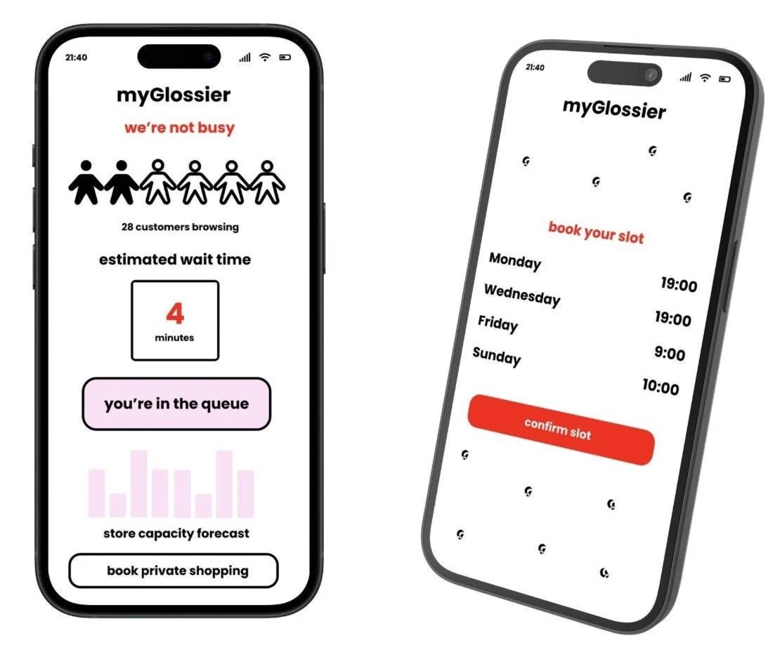
You can now see how busy the store is, so you can plan when you want to come. But not only this, Glossier now does private shopping times for those with accessibility constraints who need an extra bit of room whilst they shop. Just click on private shopping to book your slot.
Why: Manon, in a wheelchair, couldn't reach the testers or move around at all. Whilst the store has large aisles, it’s not been designed for those with disabilites. Private shopping hours lets people like Manon shop stress free.
ANSWERS · MOOD & RETENTION
myGlossier appreciates you
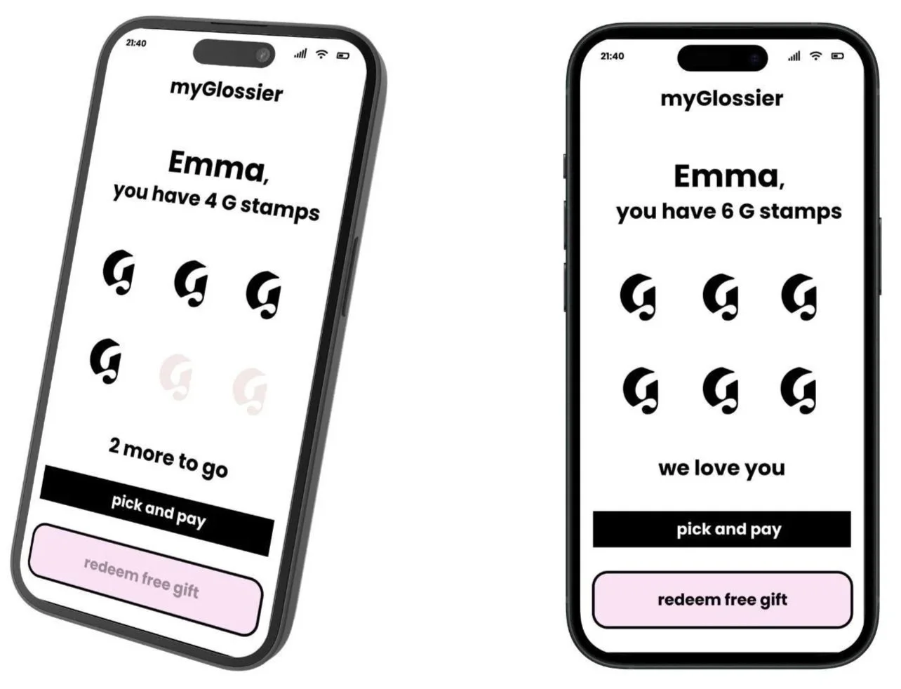
You’ve asked long and hard for a discount code. You’ve asked to feel appreciated. Now we’re here to give that to you. Now students get 10% off all year round. But not only this, you earn a G stamp everytime you shop, and when you get 6, you get a free product! Just a little thank you.
Why: customers buying one item judged the whole system harshly and said they'd go back online. However, now when they visit the store they get a G stamp, which they can’t do online.
ANSWERS · KNOWLEDGE & MOOD
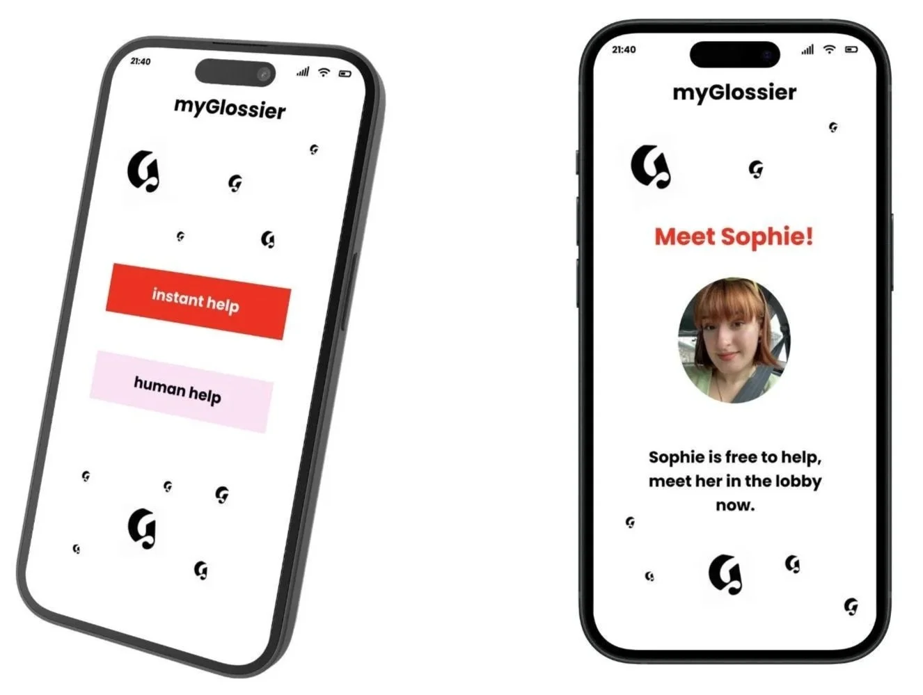
Getting help is easy
Don’t know how to pay, not sure what shade in Stretch foundation you are, don’t speak English? myGlossier sorts each one of these problems out with the touch of a finger. Plus, if you don’t feel like talking to a human (it gets like that sometimes), just talk to our AI editor and they’ll sort you out in no time.
Also, if you’re a new customer, myGlossier knows this and will tell you everything you need to know without you having to ask.
Why: quieter customers didn't ask for help and left confused, and non-English speakers were equally confused. Giving people a way to get answers without a conversation was the point of this feature.
ANSWERS · TIME
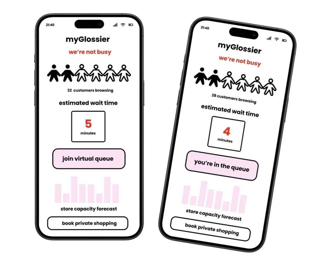
myGlossier makes queuing fun
British people may be Gold Olympians at queuing, but we still don’t like doing it, especially in the rain. Now, you can join a virtual queue instead. Just click the join button from where ever you are, and get an estimated time to wait so you can arrive and enter straight away.
Also, now when you’re waiting for your order, you can play! Become a Glossier Editor, get given duties and if you finish them all before your order arrives you get an exclusive Glossier sticker.
Why: customers were queuing on the street, then again to pay, then again to collect. This removes the first of the three, and the waiting game came directly from users asking for something to do.
ANSWERS · TIME & KNOWLEDGE
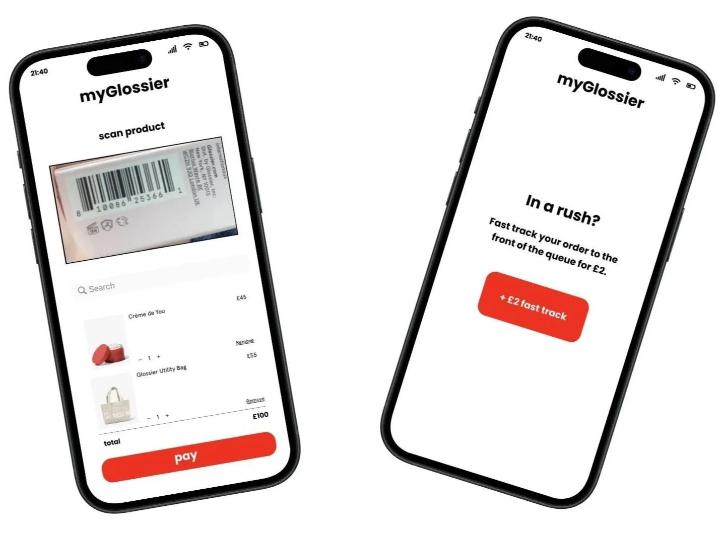
Got 15 minutes? We'll do it in five.
With ‘pick and pay’ you don’t have to find an Editor. Just scan the tester product through your phone camera. Then, streamline the process further through fast tracking your order to the front when you spend £20 or more. Get a notification to your phone when your orders ready, no more hearing your name mispronounced, hoorah!
Why: Paying was the single hardest step I observed, and it was only solvable by asking a stranger in a pink jumpsuit. This solves that issue, as they can do it all on myGlossier!
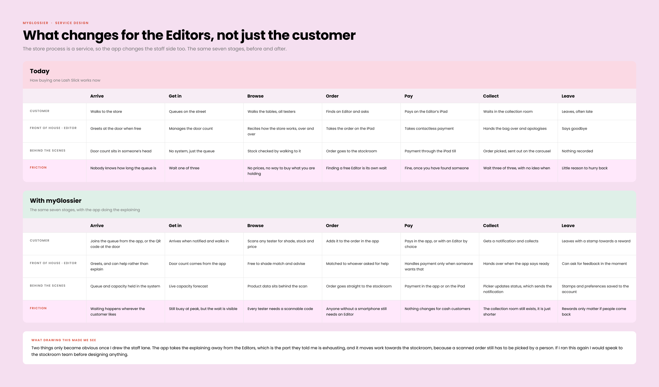
What changes for the Editors, not just the customer
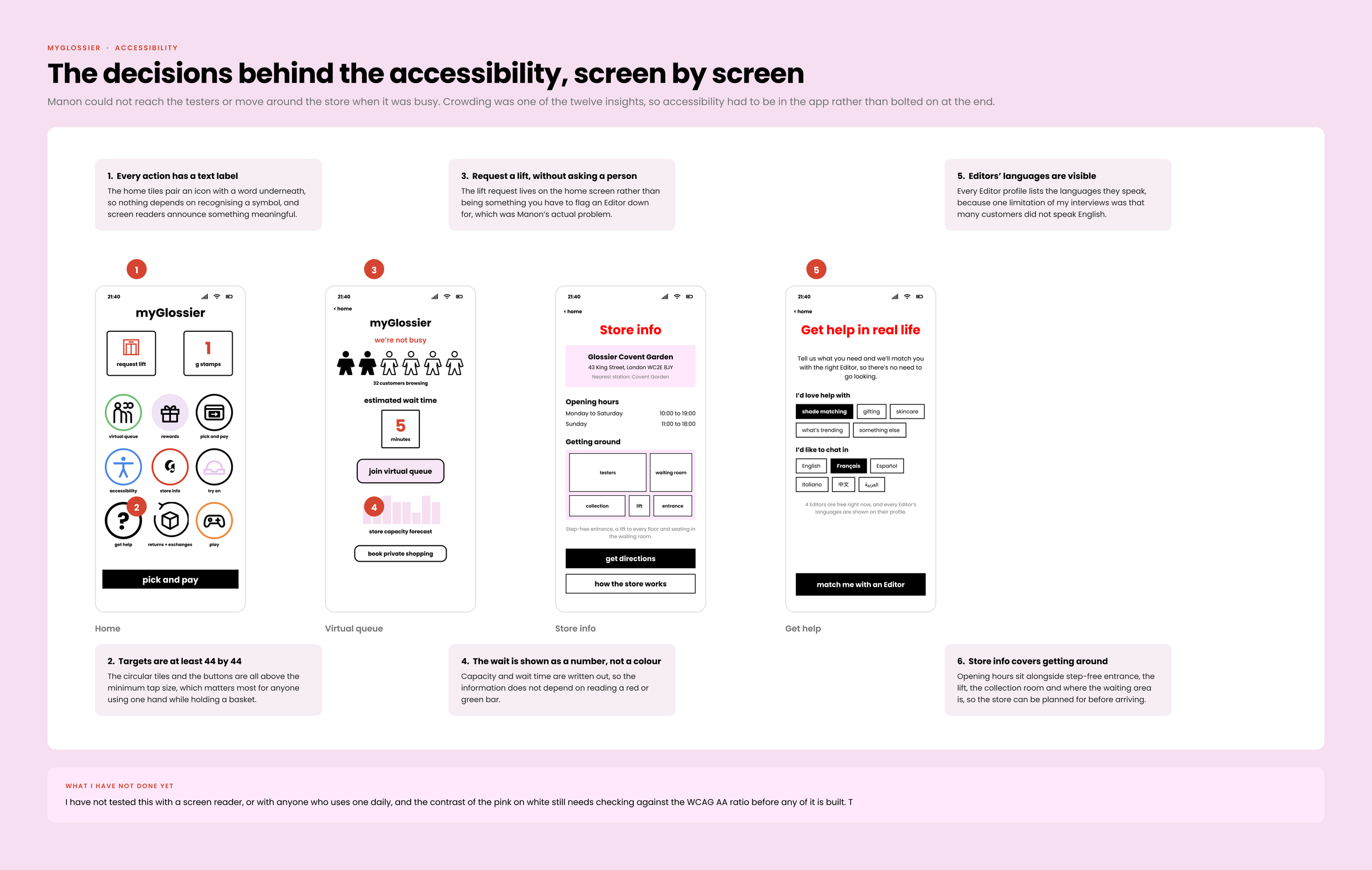
The decisions behind the accessibility
Crowding was one of the twelve insights and Manon could not reach the testers, so accessibility sits in the app rather than being bolted on at the end.
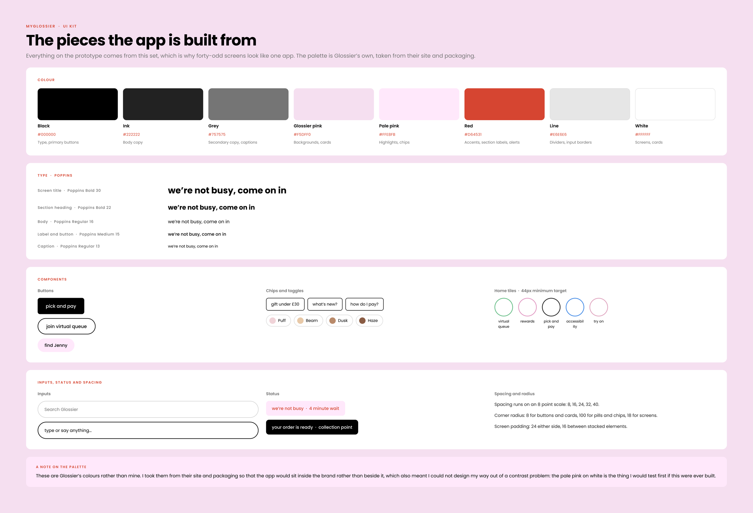
UI Kit
Crowding was one of the twelve insights and Manon could not reach the testers, so accessibility sits in the app rather than being bolted on at the end.
07
Reflection
I found a retail job, and a UX project too
I took the Glossier job to earn money while I looked for my first UX role, and ended up doing UX work while earning. It kept my UX brain whirring.
I loved living in the environment I was researching, which is not an opportunity you often get. Being able to observe and talk to customers that often meant the data was far more reliable than it would have been from the outside.
Being an employee was not always ideal, since some customers were too polite to be fully honest with me, but I could use the observations to balance that out, because actions speak louder than words.
Three things I would do differently
I should have interviewed my colleagues first
I designed the whole thing for customers, and I should have spoken to my colleagues too as it impacted them just as much (if not more).
Thanks for reading. Any questions? Contact me
I would have liked a team to think with
I did get a lot of interaction with customers, and I got to independently drive the project forward. However, it would have been highly beneficial to have team members to discuss the project with too.
I would spend more time on the branding
I love the Glossier brand aesthetic as it is, however, I think there’s always room for experimentation. I would have loved to have proposed maybe a new brand colour, or logo design to bring a sense of newness to the brand if I had longer.